I can say from my experience and observations that it is incredibly frustrating to successfully move a customer through the sales funnel and make offers that are adequately tempting to provoke their curiosity, just to lose them at the checkout. There can be many reasons why customers tend to leave their shopping carts without purchasing the product or service. The causes can range from high pricing to low credibility of the online store. In this article, let’s dive into the 7 cart abandonment reasons along with their solutions.
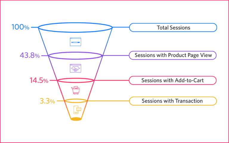
A conversion funnel showing customers who actually buy the product
Content Index:
What is cart abandonment?
Reasons for cart abandonment
7 cart abandonment statistics with solutions
What is cart abandonment?
Cart abandonment in eCommerce refers to the dropout of customers without purchasing the products in the shopping cart. Any item that enters the shopping cart but never makes it through the transaction is considered to be “abandoned” by the customer.
Shopping Cart Abandonment Rate is the percentage (%) of online visitors who add items to their shopping cart but then abandon it without making a purchase. It shows the rate at which your potential customers are leaving without buying.
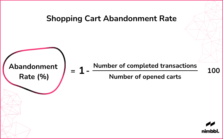
Calculating the shopping cart abandonment rate
Why do customers abandon carts?
Online businesses lose $18 billion in sales revenue each year because of cart abandonment. Additionally, It is an issue that demands high priority and it becomes important to know the exact reasons why customers abandon their carts.
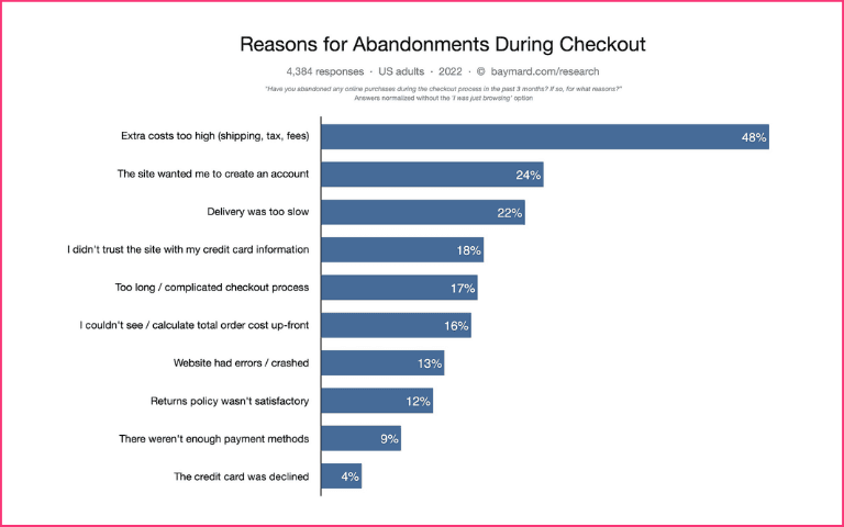
High additional costs are the primary reason for checkout abandonment
Reasons for shopping cart abandonment -
A slow website with high load times
No trustworthy or secure payment options
Customers are interested in buying in-store
Complicated checkout and poor checkout experience
Hidden additional costs
Making online shoppers sign up with their email address
Long forms
Lack of favourite payment options etc.
In this article, I have covered a wide range of cart abandonment insights to illustrate the justification of why the customers failed to complete the purchase and shed light on the most proficient method to address common issues.

7 cart abandonment statistics (and their solutions) -
1. Mobile users are 15% more likely to abandon cart
The average cart abandonment rate across all industries is 66.1%, with mobile users having an even higher abandonment rate of 80.6%. That means, out of every 10 customers, seven to eight would not complete transactions. This is problematic considering that in these times, more customers use smartphones than computers to make purchases.
The solution
This shows the significance of completely enhancing the eCommerce store experience for mobile users. Here are some steps you can take to ensure a good mobile shopping experience for your customers-
a) Fast Loading time
Nearly half of consumers expect a web page to load in less than two seconds. Optimize the page to look ‘visually complete’ under a few seconds to create a better user experience
b) Simplify the process
Typing on a mobile screen can be a real pain in the neck for your customers. Provide them with some help with auto-complete and spelling suggestions. Showing reviews and ratings against products can increase their chances of acting on the CTA.
c) Optimize buttons according to touchscreens
Make it easier for the user to use the touchscreen for doing things. Don’t port desktop features directly to a mobile device.
d) Offer one-click checkout
Personalised one-click payment options and guest checkout are some ways to make checkout flow easy for customers on mobile devices. With the Nimbbl, customers are able to complete their BNPL, UPI payments in seconds.
2. Additional costs are the #1 reason for cart abandonment
Among several factors for cart abandonment, added costs like shipping, taxes, and fees are no doubt the biggest dealbreaker. Customers don’t like surprises at this critical juncture.
The solution
This shows why it's so essential to be straightforward with added costs. Nearly 75% of consumers consider free shipping essential to making a purchase, according to an NRF study in 2019. So, if you’re not doing it already, consider offering free shipping as an incentive.
3. You lose 24% of customers by not offering a guest checkout
Being forced to create an account is the second top reason for cart abandonment. I don’t know about you, but I hate to go through the redundant process of creating an account, particularly when I intend on making a one-time order. Furthermore, roughly one-third of online customers feel something very similar.
The solution
It is highly recommended to offer a guest checkout where customers can conveniently and effortlessly make a purchase. A guest checkout for a customer can be helpful by saving them time to create an account and helping them purchase the product anonymously. The Nimbbl checkout is login-less. Here, customers see personalised payment methods without additional clicks or inputs. Here's the Magik UPI flow where customers see their UPI Ids auto-presented. No input, remembering or searching is required.
https://i.imgur.com/cGXTa4j.mp4
4. You could lose half of your customers if the entire checkout process takes more than 30 secs
Most online customers are a little impatient these days. When they realize your site is slow and sluggish, most will keep away from it at all costs.
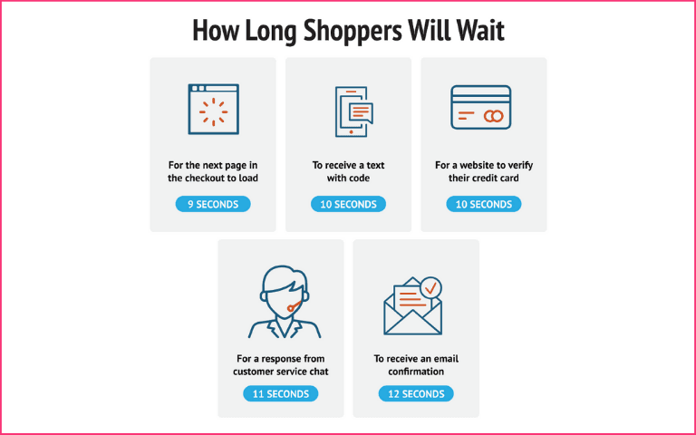
Customers have limited patience
The solution
You need to invest a great deal of energy and resources into further developing site speed and exceeding all expectations to keep load time under three seconds for all pages. Shoppers want instant gratification, and they’ll wait 9 seconds for the next page in the checkout to load, 10 seconds for a text code; 10 seconds for credit card verification; 11 seconds for live chat responses, and 12 seconds for an email confirmation. Optimize your site speed accordingly.
5. A fully optimized checkout flow can have as few as 12 Form elements and 7 form fields
The average checkout flow has 23 form elements and 15 form fields. Shopping Cart intricacy and duration are two critical components that determine the probability of somebody completing a purchase. A fully optimized checkout flow can have as few as 12 Form elements and 7 form fields. But what’s intriguing is that the top eCommerce sites with fully optimized checkout flow have roughly half as many form elements and form fields.
The solution
Here are a few things you can take into consideration while optimizing the checkout flow-
The website should make the checkout process easy to understand and short.
Each form field must be well explained for the benefit of the user.
Shortcuts that reduce customer effort greatly improve the checkout process.
Smart personalised payment methods should be presented instead of the same ones for all.
Tools that predict customers’ delivery addresses make the filling process faster.
6. 46% of shoppers abandon shopping because a discount code doesn’t work
The staggering majority of customers use coupons at 90%. This is no question a compelling method for rustling up an online business and imparting devotion to existing clients. When everything goes without a hitch, offering discount codes can increase conversions. In any case, when customers run into issues where a discount code doesn't work, almost half (46%) will abandon their cart. The point here is that offering promotion codes is smart. In any case, you should be diligent in ensuring that everything works correctly. Otherwise, it’s going to create a lot of friction that will take a toll on conversions.
The solution
It is a best practice to auto-apply coupons when available. Most carts have the ability to pass through parameters through the URL and can be applied via emails or pop-ups.
7. 76% of shoppers won’t return to your site after a poor experience
More than three-quarters of online shoppers won’t even return to your website if they have a negative first experience. This shows that any significant redundancy in the checkout process negatively impacts conversions. You should be certain that customers don't run into any issues on your site. No personalisation can make the customer experience feel not cared for and valued. There are also the chances to lose the credibility of your site.
The solution
A personalised shopping and checkout experience is crucial for the success of your website sales. Assuring them with trust badges, guiding them through every buying step and providing them with multiple payment options at the checkout can help solve this problem.
Fast payment methods like UPI; Buy Now Pay Later with a 1-Click Checkout experience help customers complete payments quickly. They need not spend time finding and entering card/net banking details. Payment success rates are also higher than traditional payment methods.

These cart abandonment insights show probably the most well-known reasons why customers abandon and the particular areas that need to be focused upon. Managing these key points should help you with decreasing your cart abandonment rate and diverting a decent portion of customers that don’t initially complete their purchase. So over the long haul, you can develop a superior customer experience, boost conversions and build stronger brand loyalty.

