eCommerce stores often neglect checkout pages. They think they’ve secured the sale once the customer adds to the cart. But that’s not true—an almost-secured sale can slip through your fingers at checkout.
Checkout cart abandonments are not rare. According to a survey, 18% of users abandon their carts due to long/ complicated checkouts. High shipping, declined transactions, account creation, etc., also result in checkout cart abandonment.
To prevent this, you must reduce friction during the checkout process. And to help you build a seamless checkout, we’ve compiled a list of inspirational checkout page designs and actionable best practices.
Content Index:
- Why should I optimise the checkout page?
- Top reasons for checkout abandonment
- Common Checkout Mistakes To Avoid
- Ideal elements of a checkout page
- Checkout page best practices
- 22 Best Checkout Design Examples
- FAQs
What is the need to optimise checkout pages?
Checkout abandonment happens when a customer does not make the final payment and instead leaves the checkout page without completing the purchase. According to research, 22% of the average cart abandonment rate of 70.19% is due to complicated checkout experiences.Optimising your checkout page design is crucial. It helps online businesses recover lost revenue. Products that customers abandon after adding to the cart due to checkout page issues have the potential to be sold eventually after optimisation.
The registered sales after this step have proven to make a massive difference in the annual profits of the businesses. Therefore, it is safe to say that checkout optimization is instrumental to the growth of a business.
Checkout optimization takes a lot of time and effort. Online businesses need to regularly do A/B testing to identify issues and determine what works best for an online business to make the checkout page attractive, seamless, easy to use, and understandable to customers. This ensures that customers do not choose cart abandonment out of frustration.
Checkout abandonment happens when a customer does not make the final payment, and instead, leaves the checkout page altogether without completing the purchase. On average, 70% of customers abandon the checkout pages. Using online analytics portals can determine the cause of why online customers move forward with checkout abandonment. However, optimising the payment checkout page design can help online portals recover lost revenue. Before understanding why it is essential to improve checkout, we must first know why customers proceed with checkout abandonment.
Key checkout process statistics:
- The average cart abandonment rate as of 2024 is 70.19%.
- 26% of online customers abandon purchases because they have to create an account, which highlights account creation as one of the roadblocks to purchase.
- 25% of users don’t purchase because they don’t trust sites with their credit card information.
- 13% of users drop their purchase due to insufficient payment options.
Using analytics tools can help determine why customers abandon their carts at checkout. However, we’ve done some research to identify the top causes. Let’s discuss.
Top reasons why customers abandon checkout
There are several reasons why customers abandon their carts during checkout. Some of them are:
Unexpected fees
Unexpected costs added to the order summary cause customers to review their purchases and ultimately change their minds. Research suggests that 48% of users abandon their carts at checkout due to high shipping, extra fees, and taxes.
Forced account creation
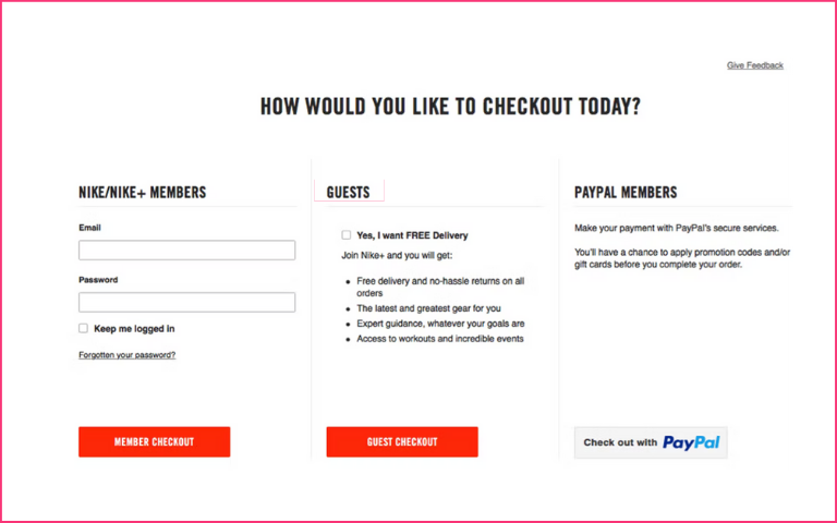
Forcing online customers to register to proceed creates obstacles for them. Instead, it is better to offer guest checkout options to your customers.
For example, Zappos offers easy account creation vs. guest checkout options, simplifying the buying process and encouraging the customer to complete the purchase.
Complicated checkout process
Online customers prefer a faster checkout page web design that is easy to navigate and understand while making online purchases. A complex checkout process can lead to checkout abandonment. Checkouts that take too much time and require detailed information run a higher risk of checkout abandonment.
For instance, Forever 21, the popular apparel brand, had a complicated checkout, losing customers in the process. After 2020, the brand initiated improvement in its checkout process across all devices with the help of Bolt, simplifying customer experience.
Many form fields to input
The more information you need, the greater the required security. This increases the time a customer takes to move from browsing for products to buying them. So, at the time of purchase, it’s better to make data input simpler and error-free.
Lack of payment and shipping options
Online websites that can’t offer unique shipping and payment options to online visitors discourage them from using the portal.
Customers like to choose their preferred courier service providers as they trust them to deliver their packages safely. If eCommerce sites don’t offer customers to use their preferred courier services, it’s more than likely that customers will abandon the purchase.
Coming to payment, most customers like to have multiple options such as credit/ debit cards, UPI, net banking, and more. If they aren’t offered the payment option of their choice, the chances of incomplete purchases increase.
With Nimbbl, you can offer several payment options, including UPI, wallets, netbanking, debit and credit cards, as well as Buy Now Pay Later (BNPL). You can also offer guest checkouts or password-less login for payments.
What elements should be there on a checkout page?
The success of an eCommerce portal boils down to how well the website can convert visitors into regular buyers. Online portals need the best checkout page design to entice buyers to go through with payment.
There are many ways to encourage an online customer to make a purchase, but how well the customer is treated at the checkout can make the difference.
The checkout page UI design should be created to ask for essential details only, including order summary with product details and customer shipping information. All eCommerce portals must have the following four key elements in their checkout page design to help improve sales:
1. Checkout UX
Customers’ User Experience (UX) must be perfect even before reaching the checkout. The UX of an eCommerce website influences the psyche of the customer. A confused-looking storefront is likely to turn online shoppers away.
The same applies to the checkout page design as well. The last thing customers want is confusion before paying for their order. They want to be sure of what they’ve ordered, the quantity, the payment mode, and how much they have to pay. So, ensure that the information is available on the page.
2. Localising currency
Giving customers the option to change or add local currencies to a website for payment can be a significant reason online customers opt for that particular website. This not only helps avoid checkout abandonment but also helps boost sales.
For example, a UK-based eCommerce site allowing payments only to be made in pounds or £ is a mistake. If the company ships worldwide, shoppers from anywhere in the world can browse the site to shop. So, if it doesn’t have an option to pay in their local currency, they may leave the portal at checkout.
Websites should offer the option to change into the local currency of the countries where the business/website is accessible or the most used foreign currency in that country.
3. Payment method
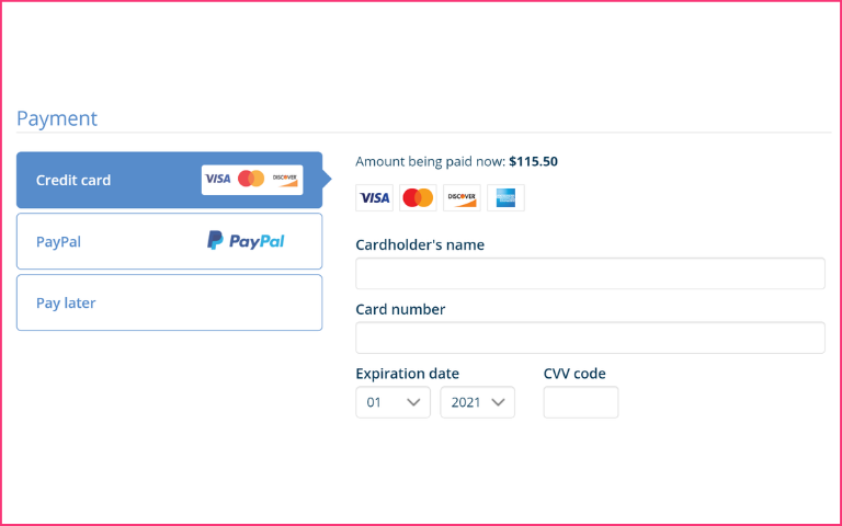
eCommerce portals must offer multiple payment options other than MasterCard and Visa. Whether it is BNPL, UPI, debit or credit cards, net banking, or other payment options like PayPal or Google Pay, online sites must offer all payment options at checkout. This way, customers will have the freedom to choose their preferred payment mode.
4. Authorisation optimisation
Authorisation makes the payment possible before it is confirmed. Online portals need to ensure customers are not blocked from making payments for their purchases.
For instance, there could be a problem with integration or API-related bugs interfering with the payment process. It may also be possible that payment providers experience downtime when processing the payment, or payment authorisation might be slow, forcing online customers to abandon the checkout process. Therefore, it is necessary that online businesses optimise payment authorisation or deploy a dedicated team to monitor the payment process 24/7, to respond and manage if any discrepancy arises.
Common Checkout Mistakes To Avoid
Not mentioning the estimated delivery date
Users start waiting for their package as soon as they place an order. Not mentioning the estimated delivery time or speed makes the ordering process less transparent. As a result, users may abandon their carts, especially if they want something within a specified time.
eCommerce sites must mention the estimated date of delivery or display “Standard: 5 business days” to give the users an idea of the delivery speed. Here’s an example of Amazon mentioning the delivery date during checkout for both express and standard order deliveries.
Not marking required and optional form fields
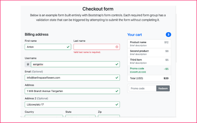
According to Baymard, 74% of online sites do not mark required and optional fields. This may result in customers missing out on crucial information. Further, customers might make submission errors and get frustrated when they’re unable to proceed without knowing which fields are necessary to complete. Such friction can increase the chances of cart abandonment and result in loss of sales.
Here’s how Biba.in marks the necessary form fields even though it asks for limited user information.
Not allowing for quantity changes
eCommerce sites should allow increasing or decreasing item quantities in the order during checkout. While this is a pretty straightforward task, sometimes the change in quantities goes unregistered. So, ensure that it is easy for customers to change the item quantities even from mobile apps.
Here’s an example of how Nykaa Fashion makes changing item quantity easy on its mobile app.
Not validating card information
Users often make mistakes when typing their 16-digit credit/ debit card numbers during checkout. Validating the card number alerts the user and helps them identify the error quickly. Without validation, they might fill out all credit card details only to find their transaction declined.
Here’s an example from Flipkart validating the card number and saving user frustration.
Checkout page best practices
The best checkout page design can be created by following a set of best practices. The best practices are as follows:-
1. Mobile-first, personalised-fast payments
In the age of the smartphone, with better connectivity, and faster internet, over 50% of online shopping is done on a mobile device. Not optimising checkout designs for mobile can result in missing out on many customers. The payment experience needs to be super fast. Your customers should be able to complete the payment in seconds. Personalised experience right through to the payment stage can set you apart from your peers.
2. Allow guest checkout
While retaining customers and ensuring they come back is important, one-time buyers are also crucial that businesses should consider. Not every customer wants to register for making a one-time purchase. They can use the guest checkout option to make purchases by entering just their email id. Forcing them to register can create an obstacle while buying products. It’s best to make life easy for them. They can be reached out later as well.
3. Don’t ask for unnecessary information
It is best for online portals to only ask for basic necessary information. Collecting only the essential information required from the customer helps streamline the checkout process. Getting customers’ emails early in the process is enough, as that is the only information online portals need to follow up with online customers to market a product to them.
Adding unnecessary steps in checkout costs the customer more time and makes their online shopping experience less convenient. It may be noted that customers are also wary of giving personal information every time they do online shopping.
4. Use a clean design and remove distractions
It takes a lot of effort and cost to entice online customers to buy products and then get them to make payments. The effort put towards converting visitors to buyers shouldn’t be hindered by distractions. A clean checkout design should be devoid of a shiny header and footer, menu buttons, and additional purchase links that may distract online customers from completing their purchase.
5. Offer multiple payment methods
It’s always better to provide online customers with as many payment options as possible. However, it may seem to be costly. So, it is better to prioritise and choose the most popular payment option first, subsequently adding other options as the number of online visitors and the business grows.
It may be noted that customers are inherently picky about the kind of payment option they use to make payments online. While most choose the best option in the portal, others choose to pay using their preferred payment option. Websites like Nimbbl provide multiple payment options for customer convenience, including Wallets, Net banking, BNPL, UPI, and more.”
6. Remove surprise costs and fees
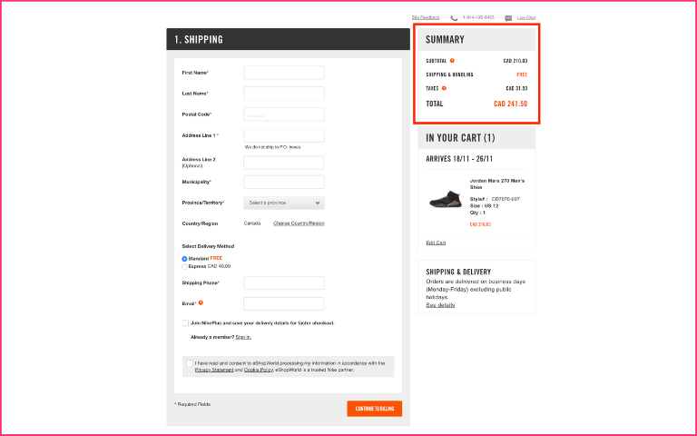
Additional costs are the prime reason customers abandon checkout at the very last second, as they start second-guessing the ultimate value of their online purchase. Online customers abruptly checking out will result in an increased checkout abandonment rate. It is better for online portals to provide as many details as beforehand, including subtotal, shipping fees, applicable tax, and total pay to allay fears of online customers of any additional cost added to the cart.
7. Show security badges and seals
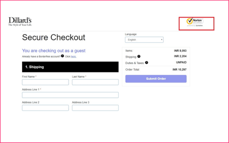
It is best for online portals to display security badges and seals in the payment checkout page design, giving online customers confidence that the eCommerce portal is safe for a transaction. These seals and badges shown throughout the checkout page web design allay fears of security the online customer has regarding a safe, transparent payment system that will ensure data entered is protected, ultimately ensuring peace of mind.
8. Use form validation to notify an error
Online portals need to enable form field validation in real-time. It helps customers input data and allows shopping portals to collect information as accurately as possible. As a best practice, online portals must also flash error notification alerts if data entered by online customers cannot be accepted or knowingly/unknowingly skips a form field. This will ensure that the online customer doesn’t miss out on a step while entering data. This helps online portals validate every transaction.
9. Connect to customer support
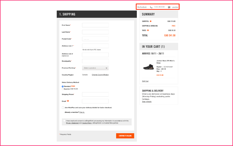
It is a part of the best practice for online shopping websites to offer customer support to customers. The key is to provide customer support at the right time when they need it. Customer support could well be the difference between a completed sale and an abandoned cart at the right time. Customer support can be provided through a knowledge base, a 24/7 call centre, or a live chatbot.
The key is to provide online customers with multiple options to communicate. The online customer could use any method to communicate with the portal. Offering the right kind of support to customers can help keep them on the portal by addressing their concerns and eventually result in a buy, reducing cart abandonment rate and checkout abandonment rate.
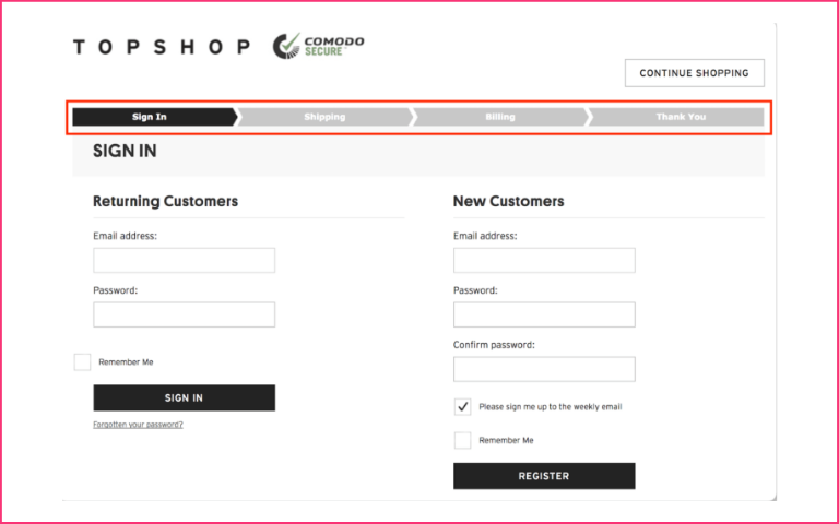
10. Using progress indicator to guide checkout
Whether an online portal uses a one-page, multi-page, or multi-step checkout process, integrating it with the progress indicator helps. It allows customers to keep track of where they are in the checkout process. It also helps them review their completed steps and analyse the steps yet to come. This gives online customers an idea of how long they have spent and how much more time will it take to complete the payment process.
11. Allow social sign-in to speed up the registration
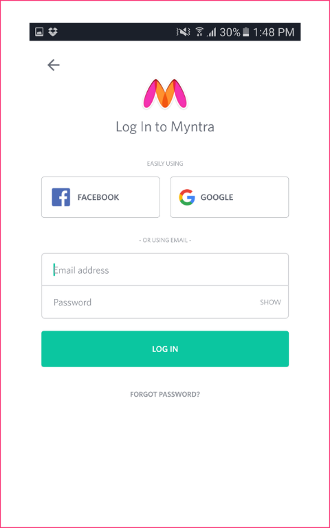
Allowing customers to sign-up or register using the social media account lets online customers connect using a pre-existing account. This helps shopping portals verify their identity and helps collect a variety of other details, such as personal details that they may have entered using their social media account.
This helps save customers a number of steps they may have to follow to access their accounts. This saves time and helps improve customers’ experience, motivating them to return to the online store.
12. Auto-save cart contents when abandoned
Saving shopping cart contents or simply auto-saving the items when they abandon the cart can help online customers. It helps save their time by allowing them to return to their checkout instantly, eliminating the need to browse through the entire shopping website and select the products again to the shopping cart.
Auto-saving increases the chance that customers will return to the portal and restart exactly from that spot where they had previously left off, thereby avoiding the need to repeat that process.
13. Using discount and promo codes
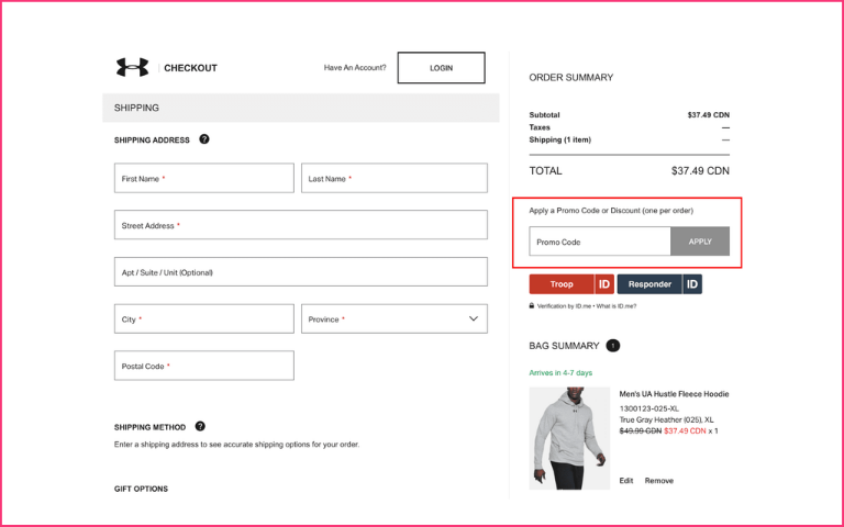
Online portals sometimes offer discounts or promo codes to online customers to entice them to the checkout page. Customers who don’t have a discount code may search for a discount code. A discount code can help customers make it easy to enter the shopping portal.
As a best practice, not making it too prominent for customers can help customers rethink entering. Making it too obvious discourages them as they are more aware of their price.
14. Send post-payment order confirmation
Once a customer completes an online purchase, the online portal should follow it up with a post-purchase order notification and a thank you note sent via email. This notification summarises the details of the order placed by the customer, including shipping cost, taxes, item count and details, final total/ subtotal, estimated delivery time, and/or any other information that may help the customer. A thank note expressing the online portals’ gratitude to customers for choosing their service even if they are one-time buyers can help enhance the customer experience.
15. Use clear CTA captions
Online shopping portals must give importance to the state of mind of customers. They need to anticipate what online shoppers understand when faced with specific commands or descriptions. Online portals must use proper descriptions such as “Continue Shopping, Proceed to Checkout, Complete Order, and/or Apply Coupon.”
These simple yet direct messages help online users know beforehand where they will be redirected after clicking on a particular button. Also, ensure that optional and required fields are marked to avoid checkout abandonment.
16. Use by default shipping address as billing address
It is best practice for online portals to do everything that helps reduce customers’ time to fill in details before checkout. The easiest way to do this is to allow the online customers to copy the same shipping address as the billing address. Though many online customers may not share the same shipping and billing address, it is better to have an option to keep shipping and billing addresses separate for clear identification.
17. Use the best checkout page UI design
Online portals must use the best checkout page UI design to make portal checkout relatively “risk-free” for online users. If checkout page UI design is not ideal, online users may skip fields that are not relevant to them. The use of incorrect interface types is also one of the reasons for checkout abandonment. Additionally, avoid using radio buttons and drop-down lists during checkout.
18. Allow ‘Back’ option during checkout
It is best for online shopping portals to offer users a “Back” button during the checkout phase. The Back button allows them to review and, if needed, correct/edit the previous step, regardless of whether it’s technically the same or a separate page. This should be applied sitewide, including those with accordion checkouts.
On shopping websites where accordion steps are implemented as a single page with a single URL, users trying to go back may be sent back to the cart selection or account selection step. This may also be the reason for checkout abandonment.
19. Avoid using jargon during checkout
Online portals need to avoid jargon in their checkout stage. It may be noted that most of the online users of shopping portals visit the websites infrequently; only a few regularly visit to make purchases. This makes online users sensitive to site-specific names/jargon. While website employees who own and operate the website may understand and know the meaning of website-specific terms, it is not fair to expect online users to be aware of some, if not all, of them.
Using jargon may result in online users being forced to spend more time understanding the meaning of jargon. This may delay their checkout process, forcing many to abandon the checkout. As such, shopping websites need to carefully determine the word choice on the checkout page and only use something that a general user would easily understand.
20. Correctly format the “expiry date” field
ISO 7813 standard specifies characteristics of “Financial Transaction Cards”. Shopping carts need to follow these in the checkout stage, especially if the online user uses a card for payment. ISO 7813 specifies that all financial transaction cards must show the card’s expiration date being used to make payment during the checkout phase, in either of the two formats; “MM-YY” or “MM / YY”. “MM / YY” is the most commonly used format for credit cards.
“MM / YY” represents two digits for the month and two for the year, e.g. “02 / 18”. However, many websites still use a nonstandard format, which creates unnecessary disruptions to the input flow of online users during the checkout stage. This forces users to pause and carefully look at the date format used and often use the keyboard to input expiration date info carefully.
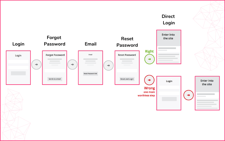
21. Make forgotten password reset easy
For repeat customers, checkout is easy as most of them save their email id, shipping address, and payment details. Since they are regular visitors to the online portal, it is easier to remember their username and password. But the problem is with irregular visitors or customers who don’t want to create an account. They prefer to checkout as a guest by using an email id.
But there are irregular visitors to online portals, and it is difficult for them to remember usernames and passwords. It is easy to remember the username, passwords, and security codes of essential portals like banking websites, social media accounts, etc., but difficult to remember the username and passwords of a shopping portal that one visits seldomly. Inevitably irregular visitors are bound to forget the password even if they remember the username, which often is an email id. For such cases, the payment checkout page design of online portals should have an option to either retrieve passwords or reset passwords, if and when, the user forgets the current passwords through a two-step security process. The key to making life easier for online visitors is to make the password reset as smooth as possible.
22 best checkout design examples
1. Nimbbl
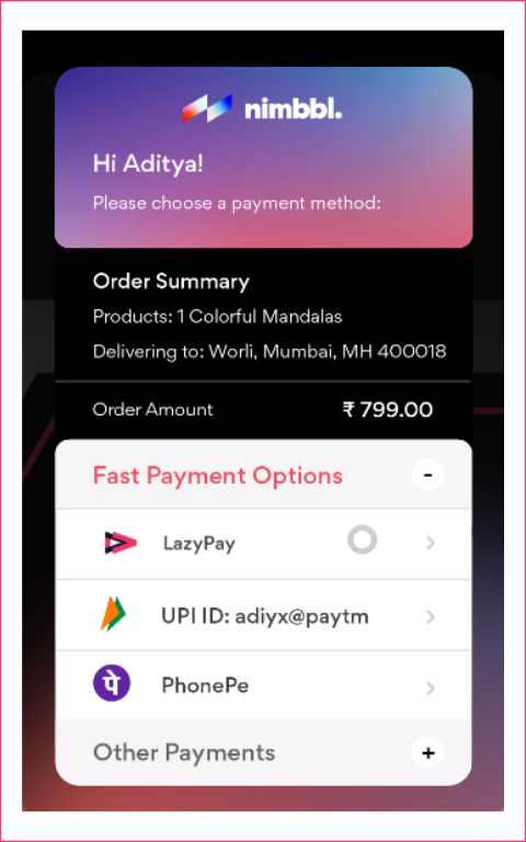
Nimbbl’s checkout shows personalised payment options, which makes checkout convenient and faster for users.
Pros
- Show payment methods in a personalised way
- Integration with top payment gateway aggregators
- Save on time and technical effort
- New-age payment methods like Buy Now Pay Later and UPI are shown prominently

2. H&M
H&M has a minimalistic one-column checkout flow that includes necessary form fields along with a clear order summary.
Pros
- Summary visible
- Easy to understand
Cons
- Slow loading
- Uncomfortable to use – many form fields to be entered
3. Minimalist
Minimalist has a simple, intuitive, and user-focused checkout page with a clean layout taht includes sections for email, delivery, and payment details.
Pros
- Easy to understand
- No unnecessary details
Cons
- Customised payment methods are not available
4. PharmEasy
PharmEasy has a well-structured checkout form with order details and a bill summary. The checkout form with required fields is displayed as a slide-out on the same window, reducing the back-and-forth friction.
Pros
- Ideal for desktop users
Detailed with a bill summary
Cons
- Multiple pages and scrolls for mobile
5. Tictail
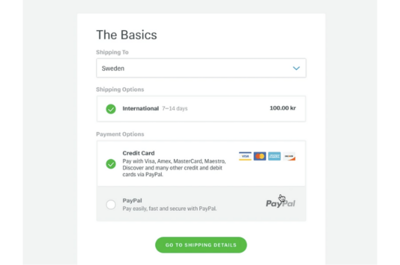
Tictail’s detailed yet user-friendly checkout page design requires only essential details like shipping, contact, and payment.
Pros
- Simple and easy
- User-friendly and convenient
Cons
- Lack of shipping alternatives
6. IKEA
IKEA’s mobile checkout form is intuitive, with home delivery and store collection options and multiple payment options.
Pros
- Multiple payment options
- User-friendly and convenient
Cons
- Too many taps and scrolls required by the user
7. Flipkart
Flipkart’s credit card checkout form is short, easy to fill out, and also supports validation. If a user types the wrong card number, it is shown as invalid to prevent declined transactions later.
Pros
- User-friendly and convenient
Cons
- Optimised for only one type of payment method, i.e., cards
8. Samsung
Samsung’s checkout page is well-designed with easy access to eligible offers, a voucher code field, order cancellation details, and an order summary.
Pros
- Includes order cancellation information
- Provides a link to eligible offers for easy discount code access
Cons
- Too many details required
9. Sephora
Sephora’s checkout page uses a minimalistic two-column form layout. It is simple and easy to follow and displays a price summary of the order.
Pros
- Simple and intuitive
- Detailed with price and order summary
Cons
- No guest checkout
10. The DigiStore
DigiStore, a Webflow eCommerce store, has a well-organized checkout page design divided into sections for customer information, delivery, and payment.
Pros
- Easy access to the discount code field
- Progress bar to show checkout steps
Cons
- Too many required fields to fill out
11. Lugz
Lugz Footwear’s detailed checkout page design mentions how customer data will be used, the frequency of SMS updates, and more. It also shows the order summary with payment options for transparency.
Pros
- Multiple payment options
- Displays a clear order summary
Cons
- Multiple fields and check boxes
12. Myntra
Myntra’s checkout landing page includes the order summary and total amount, making it easier for users to make changes, if required.
Pros
- The order summary is easily visible
- Gift card and coupon code field
Cons
- Multi-page checkout with address and payment details in different pages
13. Trip.com
Trip.com’s travel chatbot makes flight bookings easy via chat. It helps you find the best-priced flights, create itineraries, book hotels, and suggest tourist places.
Pros
- Easy flight/ hotel searching and booking
Cons
- Lack of personalised payment methods
14. Casper
Casper’s checkout page is detailed, with form fields for billing information, an order summary, and an express checkout option.
Pros
- Detailed information available
Cons
- Multiple form fields to be entered
- Multi-step process
15. Meesho
Meesho’s checkout process is user-friendly. The cart page has a detailed order summary, and the address and payment pages show the total amount.
Pros
- Option to use the stored credit card details
- Order information is easily visible
Cons
- Multi-step process
16. Bellroy
Bellroy has a detailed three-column checkout flow that includes form fields for billing address, shipping method, and payment options. Plus, it shows an order summary for review.
Pros
- Detailed order and payment information available
Cons
- A lengthy process with many form fields
17. Etsy
Etsy has a well-structured and intuitive checkout process with detailed form fields and a guest checkout option.
Pros
- Multiple payment methods
- Guest checkout option
Cons
- Detailed billing form
18. ASOS
ASOS has a short and user-friendly checkout form with an easy-access voucher/ coupon field and order summary for clarity.
Pros
- Detailed order information is available
- Easy delivery country selector with address finder
Cons
- It repetitively asks for basic customer information like the name, email ID, and contact number
19. Amazon
Amazon’s mobile checkout form is comprehensive, with order details on several checkpoints and multiple payment options.
Pros
- Recheck order details at multiple checkpoints
Cons
- Too many steps with a lengthy process
20. Sixdoors
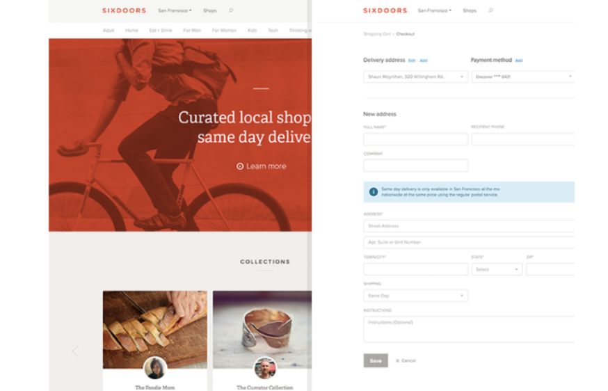
Sixdoors has designed a minimalistic checkout process with fewer steps, making it straightforward and user-friendly.
Pros
- Users get clarity in the overall shopping and checkout process.
- Detailed order information with instructions
Cons
- Too many form fields to be entered
21. DealShip
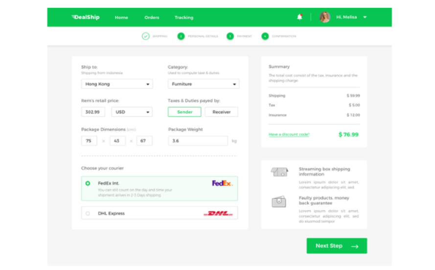
As a shipping app, DealShip’s checkout details differ from those of other eCommerce sites. It asks for minimal details, offers multiple payment methods, and displays billing information.
Pros
- Useful for complex purchases with different SKUs
Cons
- Lengthy process
22. Apple
Apple offers a simple checkout process with delivery options and detailed instructions for delivery at the doorstep and pick-up from store options.
Pros
- Offers guest checkout and multiple payment options
- Saves card details on account creation
Cons
- Multiple form fields
Conclusion
2. H&M
H&M has a minimalistic one-column checkout flow that includes necessary form fields along with a clear order summary.
Pros
- Summary visible
- Easy to understand
Cons
- Slow loading
- Uncomfortable to use – many form fields to be entered
3. Minimalist
Minimalist has a simple, intuitive, and user-focused checkout page with a clean layout taht includes sections for email, delivery, and payment details.
Pros
- Easy to understand
- No unnecessary details
Cons
- Customised payment methods are not available
4. PharmEasy
PharmEasy has a well-structured checkout form with order details and a bill summary. The checkout form with required fields is displayed as a slide-out on the same window, reducing the back-and-forth friction.
Pros
- Ideal for desktop users
Detailed with a bill summary
Cons
- Multiple pages and scrolls for mobile
5. Tictail
Tictail’s detailed yet user-friendly checkout page design requires only essential details like shipping, contact, and payment.
Pros
- Simple and easy
- User-friendly and convenient
Cons
- Lack of shipping alternatives
6. IKEA
IKEA’s mobile checkout form is intuitive, with home delivery and store collection options and multiple payment options.
Pros
- Multiple payment options
- User-friendly and convenient
Cons
- Too many taps and scrolls required by the user
7. Flipkart
Flipkart’s credit card checkout form is short, easy to fill out, and also supports validation. If a user types the wrong card number, it is shown as invalid to prevent declined transactions later.
Pros
- User-friendly and convenient
Cons
- Optimised for only one type of payment method, i.e., cards
8. Samsung
Samsung’s checkout page is well-designed with easy access to eligible offers, a voucher code field, order cancellation details, and an order summary.
Pros
- Includes order cancellation information
- Provides a link to eligible offers for easy discount code access
Cons
- Too many details required
9. Sephora
Sephora’s checkout page uses a minimalistic two-column form layout. It is simple and easy to follow and displays a price summary of the order.
Pros
- Simple and intuitive
- Detailed with price and order summary
Cons
- No guest checkout
10. The DigiStore
DigiStore, a Webflow eCommerce store, has a well-organized checkout page design divided into sections for customer information, delivery, and payment.
Pros
- Easy access to the discount code field
- Progress bar to show checkout steps
Cons
- Too many required fields to fill out
11. Lugz
Lugz Footwear’s detailed checkout page design mentions how customer data will be used, the frequency of SMS updates, and more. It also shows the order summary with payment options for transparency.
Pros
- Multiple payment options
- Displays a clear order summary
Cons
- Multiple fields and check boxes
12. Myntra
Myntra’s checkout landing page includes the order summary and total amount, making it easier for users to make changes, if required.
Pros
- The order summary is easily visible
- Gift card and coupon code field
Cons
- Multi-page checkout with address and payment details in different pages
13. Trip.com
Trip.com’s travel chatbot makes flight bookings easy via chat. It helps you find the best-priced flights, create itineraries, book hotels, and suggest tourist places.
Pros
- Easy flight/ hotel searching and booking
Cons
- Lack of personalised payment methods
14. Casper
Casper’s checkout page is detailed, with form fields for billing information, an order summary, and an express checkout option.
Pros
- Detailed information available
Cons
- Multiple form fields to be entered
- Multi-step process
15. Meesho
Meesho’s checkout process is user-friendly. The cart page has a detailed order summary, and the address and payment pages show the total amount.
Pros
- Option to use the stored credit card details
- Order information is easily visible
Cons
- Multi-step process
16. Bellroy
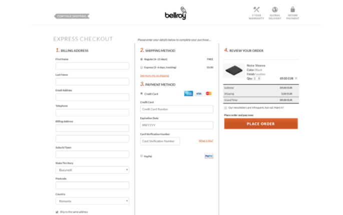
Bellroy has a detailed three-column checkout flow that includes form fields for billing address, shipping method, and payment options. Plus, it shows an order summary for review.
Pros
- Detailed order and payment information available
Cons
- A lengthy process with many form fields
17. Etsy
Etsy has a well-structured and intuitive checkout process with detailed form fields and a guest checkout option.
Pros
- Multiple payment methods
- Guest checkout option
Cons
- Detailed billing form
18. ASOS
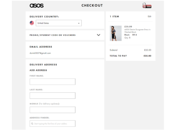
ASOS has a short and user-friendly checkout form with an easy-access voucher/ coupon field and order summary for clarity.
Pros
- Detailed order information is available
- Easy delivery country selector with address finder
Cons
- It repetitively asks for basic customer information like the name, email ID, and contact number
19. Amazon
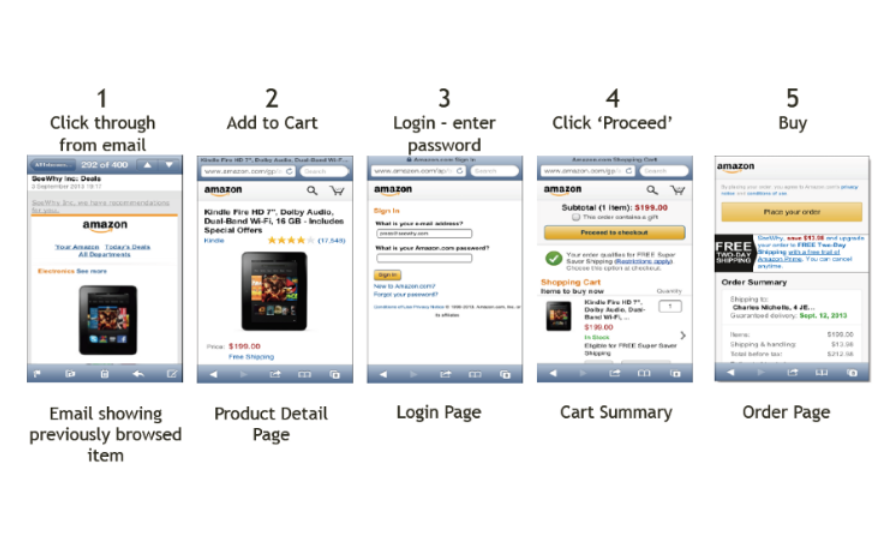
Amazon’s mobile checkout form is comprehensive, with order details on several checkpoints and multiple payment options.
Pros
- Recheck order details at multiple checkpoints
Cons
- Too many steps with a lengthy process
20. Sixdoors
Sixdoors has designed a minimalistic checkout process with fewer steps, making it straightforward and user-friendly.
Pros
- Users get clarity in the overall shopping and checkout process.
- Detailed order information with instructions
Cons
- Too many form fields to be entered
21. DealShip
As a shipping app, DealShip’s checkout details differ from those of other eCommerce sites. It asks for minimal details, offers multiple payment methods, and displays billing information.
Pros
- Useful for complex purchases with different SKUs
Cons
- Lengthy process
22. Apple
Apple offers a simple checkout process with delivery options and detailed instructions for delivery at the doorstep and pick-up from store options.
Pros
- Offers guest checkout and multiple payment options
- Saves card details on account creation
Cons
- Multiple form fields
Conclusion
Though the reasons for shopping cart abandonment are almost the same as checkout abandonment, the impacts are reasonably different.
Online portals must ensure that whenever visitors select items from their catalogue, they go through the entire process until the checkout. If they abandon the checkout due to a clumsy checkout page design, it will inevitably lead to revenue loss and adversely impact the website’s reputation. As such, portals must make checkout pages a smooth affair for online visitors, whether regular or irregular.
At Nimbbl, we understand that flexibility and convenience are the key to offering seamless payment experiences for businesses and customers. Our Multi-Payment Gateway Solution integrates multiple payment gateways into one unified platform, allowing you to accept various payment methods securely and efficiently.
FAQs
A good checkout page should have minimal form fields. It should be personalised for every customer and they should be able to checkout in a super-fast way. The collection of unnecessary and redundant information in the form fields should be avoided.
A checkout page is a website page a customer uses to conclude an online purchase transaction. The page is a digital equivalent of a checkout counter of any brick-and-mortar store. Depending on the nature of the transaction and product or service being offered, there can be a single checkout or multiple pages on eCommerce websites. It gives the customer a variety of payment options and displays the shopping cart’s total value.
A single-page checkout offers better conversion rates than a multi-page checkout. The shorter the checkout form, the better the conversion rate.

