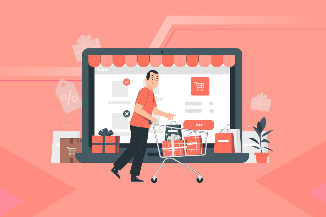
Confused that you are getting traffic, but sales are not increasing? You are not alone. A lot of eCommerce sellers out there are facing the same problem. And the most common reason for that is cart abandonment. Shopping cart abandonment is one of the biggest and most frustrating problems online sellers have to go through today. The average cart abandonment rate is 60-80%, which badly impacts sales. As a result, online businesses might lose, on average, a whopping $18 billion every year in sales revenue. Can it get better? Is there any way to reduce these abandonments? Well, here’s the thing, you can’t wipe out cart abandonment entirely, but you can certainly reduce it. One-page checkout is one such way to do this. This article will talk about the causes behind cart abandonment and the solutions to reduce them. So, let’s get started.
Content Index:
- What is a one-page checkout?
- How does one-page checkout work?
- Types of one-page checkout
- The benefits of one-page checkout
- Best practices to follow in designing a single-page checkout
- One-page or multi-page checkout: which one to choose?
- Tips to optimise a single-page checkout to reduce checkout abandonment
- Six best one-page checkout examples
- FAQs
What is a one-page checkout?
One-page checkout, also known as one-stop checkout, helps eCommerce store owners enhance the shopping experience. The entire checkout process is completed on a single page using a single form. One-page checkout aims to keep the process quick and straightforward for customers.
How does one-page checkout work?
One-page checkout is the series of processes a customer follows to complete their shopping cart purchase from an eCommerce store. This includes every step that the customer goes through, right from the beginning, i.e., choosing the product(s), to the end; i.e., making the final payment.
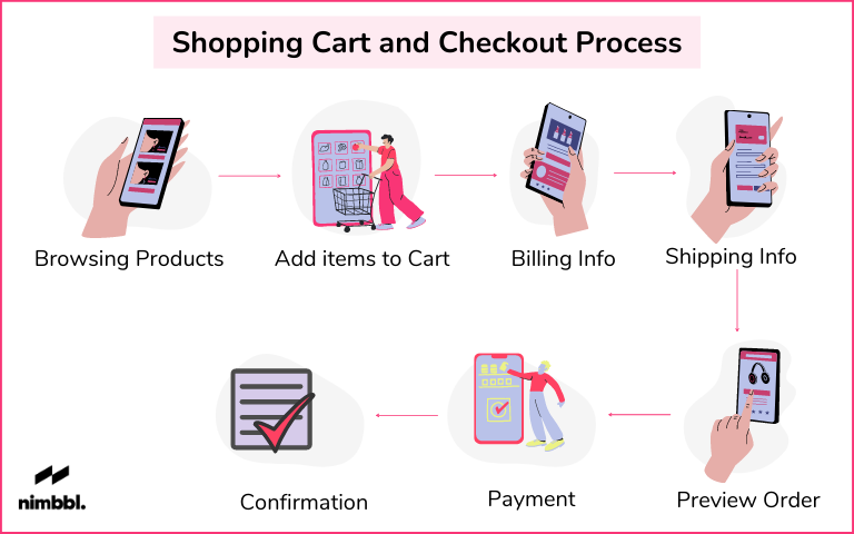
Here, take a look at the seven steps involved in the checkout process:
1. Initial checkout:
The checkout process begins when the customer leaves the shopping cart to move to payment. This is typically done through a call-to-action, something that may be labelled as “checkout” or “pay now.” Once the customer has completed this step, they move forward to checkout.
2. Login or sign up:
Now, this is an optional part. You may ask your customer to sign up or log in before making the payment. However, we would recommend not imposing this option on first-time buyers as this will only act as a hurdle in their process and defer the checkout process.
3. Billing information:
Entering billing details is an essential part of any checkout process. The form should be designed in a way that the customers find it easy to fill in their details and choose the payment option.
With Nimbbl, your customers see their preferred payment methods without having to do any additional steps. They are able to complete their payments faster, and you get higher conversion rates.
4. Shipping information:
People choose online shopping because they can get the products delivered to their doorstep easily. Now imagine if the customer finds it hard to fill in the shipping details and ends up getting frustrated and leaving the cart. You wouldn’t want that, would you? So, a great practice is to keep the design of the form easy. Do not fill the form with unnecessary columns.
1. Shipping method:
While the customers are filling in the shipping details, it is better if you ask them their preferred shipping method. Provide them with as many options so that they can choose their preferred option.
2. Preview order:
Once all the details are filled in, give your customers an option to preview the order to know if they have made any mistakes anywhere. Try to display as many things as you can in the preview screen, from products added to a payment method to address everything.
3. Payment confirmation:
Mostly on the preview screen, customers are asked to confirm their payment. Now, this is the final step of a one-page checkout. Therefore, you must keep the call-to-action as prominent as you can; that will help you finalise the sale.

Types of one-page checkout
One-page checkouts are of three types. Let us understand each one of them in detail now:
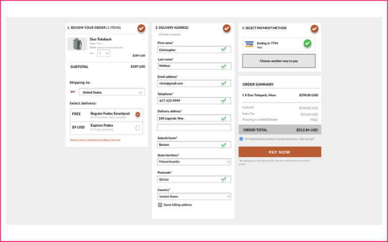
Single page checkout:
The type of checkout page where you can see every element on a single page is known as one-page checkout. From cart content to payment details to shipping information, you get everything on a single page, and that ultimately reduces the number of clicks and makes the checkout process faster.
Accordion checkout:
An accordion checkout also contains all the checkout steps on one single page but one section after another. This means once the customer has filled in the details of one section, they can proceed to another section. Users can’t fill in other sections before completing the first one.
False page checkout:
In a false page checkout, all the data is displayed at one time, but the customer needs to fill them separately. A false page checkout is more of a mix of single-page checkout and accordion checkout that shows you all the required fields and guides you to the next section after one section is filled.
The benefits of one-page checkout
The main benefit of having one-page checkout is that it makes the entire process quick. Visitors now don’t have to move to multiple pages to get the payment done. Let’s talk about some of the significant benefits of one-page checkout:
1. Reduced steps:
The most beneficial part of a one-page checkout is that it reduces the steps involved in the process. This means customers don’t have to spend time figuring out what they need to do. Instead, the entire process becomes quick and efficient.
2. Enhanced speed:
A 1-page checkout saves the time that a customer might have spent switching between the screens for payment or adding to the cart, thereby enhancing their shopping experience.
3. Convenience:
One-page checkout is easier for customers to use. As the steps involved are limited and there is only one form for the customers to fill, they can enter the information at their speed and with accuracy.
4. Smooth navigation:
Since the steps are limited and there are fewer clicks, the customers are likely to feel that the single-page checkout navigation is smooth and easy.
5. Reduced cart abandonment:
Your goal should be to design a one-page checkout that helps in enhancing the shopping experience and ultimately reduces cart abandonment.
Best practices to follow in designing a single-page checkout
The best practice is to keep the checkout process clean and simple. However, let’s have a look at the elements needed in the single-page checkout:
1. Items count:
Always add an item counter in your one-page checkout, especially if you are an eCommerce store selling a huge variety of items. This helps the customers keep a check on the number of items they have added to their list.
2. Product information:
Another important thing is product information. Do not just put the product’s image or name on your page. Instead, try to add as much information as you can. Be it the product’s size, detailing, price, features, or other interesting details.
3. Wishlist:
Now, this is an important part. Give customers the ability to save the products for later so that they can come back again and purchase the products once they have made up their minds.
4. Checkout experience:
The time required to complete the payment is the final deciding factor, whether you are going to make revenue out of it or not. Therefore, lay everything on the table; any coupon, discount, subtotal, savings, whatever you can add, show it on the page. A One-Click Checkout experience will go a long way to giving a great experience to your customers, ultimately winning their trust and leading to repeat purchases.
Note:
This feature lets you personalise the shopping experience for the customers. You can ask them for feedback or provide them with any valuable piece of information.
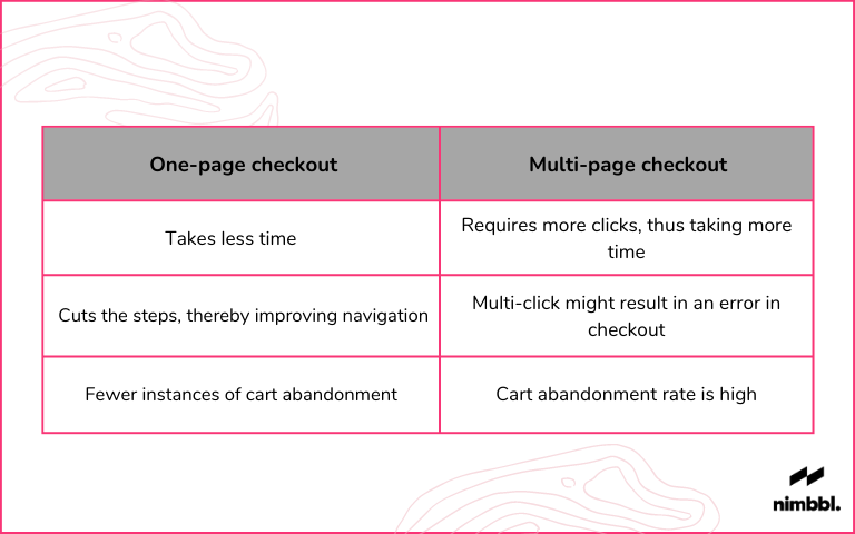
One-page or multi-page checkout: which one to choose?
We now know what a one-page checkout is. Let us understand about the multi-page checkout.
A multi-page checkout breaks out the entire checkout process into multiple pages and clicks. Customers need to fill in their details on every page to reach the payment option. eCommerce store owners generally have the dilemma of which checkout process to choose. If you, too, are facing the same issue, let us make it easier for you – go with a single-page checkout.
As the process is simple and quick, customers do not leave the cart midway, thus helping eCommerce store owners to make more profit. Understand it like this – you go to an offline store, put everything that you need in the basket, and finally reach the billing counter. Now, which counter would you choose? The one having less crowd or the one that is overcrowded?
We believe you would choose the one having less crowd. Similar is the case with one-page checkout and multi-page checkout. Customers prefer one-page checkout more because it is easy to use.

Tips to optimise a Single-page Checkout to Reduce Checkout Abandonment
It’s not just about switching to single-page checkout. The focus, however, should be to optimise the checkout page in a way that the abandonment rate is reduced. Let us now understand how to achieve this:
1. Simplify your page:
Simplify the page as much as you can. You may want to design your page to look eye-catching, but remember, the idea is to keep it clean for an enhanced shopping experience. Place the CTAs in the right place, making it easier for the customers to quickly view and click on them.
2. Keep updating order summary and pricing input:
Actively updating the order summary and pricing details throughout the checkout process helps users have the most relevant information about the payment.
3. Add the final price in the CTA:
Your final price should be what is needed to complete the one-page checkout process. When you include this option, make sure there is no distraction on the page to confuse your customers. This step should solely focus on finalising the sales.
4. Build trust factor:
When you add relevant security processes, including confidential pin entering, security badges, fraud protection, etc., to your one-page checkout, you make your customers trust you more, thus enabling them to complete the checkout process without any worry.
5. Simplify the form length:
Do not add irrelevant form columns to make the form lengthy. Only ask what’s needed and is important for the checkout process.
6. Optimise for mobile use:
If your page is not optimised for mobile phones, you are losing out on a lot. Most buyers nowadays use mobile phones to do shopping; in such a case, you need to have your single-page checkout page optimised for mobiles.
7. Add customer support:
It might be that customers can get stuck at some point during the checkout process. If the issue is not resolved soon, they might end up abandoning the cart. Therefore, you must add the customer support option to your one-page checkout.
Six best one-page checkout examples
Designing a checkout process from ground zero can be complicated. While all these tips and tricks can help you with what you are looking for, sometimes it’s better to learn from others.
Let’s have a look at the five best one-page checkout examples that might act as your inspiration:
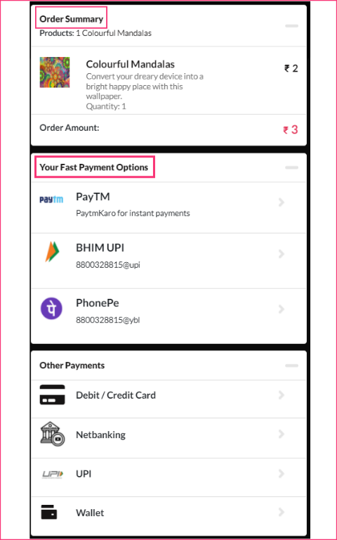
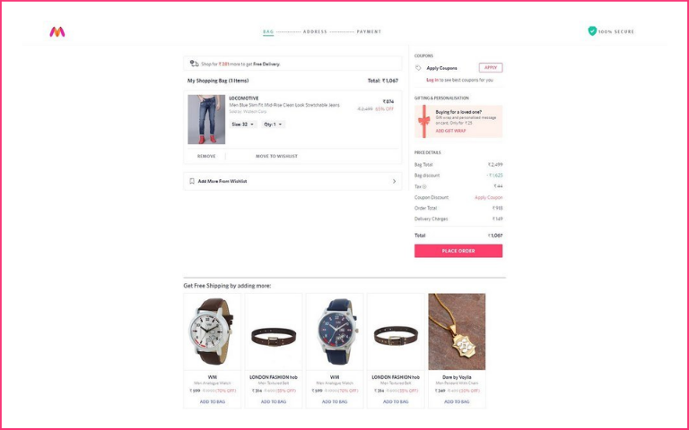
1. Nimbbl checkout:
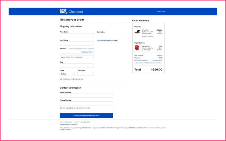
2. Best buy

Best Buy’s checkout page is simple, making it one of the favs of the buyers. You just need to provide your shipping information and contact details. And you can proceed to the payments page. You also get the benefit of checking out items as a guest before signing up or logging in.
3. Nordstrom
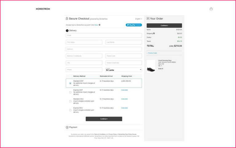
Nordstrom has a very clean checkout process, and the website processes orders in two steps. In the first step, you will be asked for your details, and the next step is the payment method.
4. Myntra
Myntra has one of the fastest checkout processes we have seen. You can reach the checkout page in just two clicks, and the page loads in seconds, so the entire process is quick.
5. Walmart:
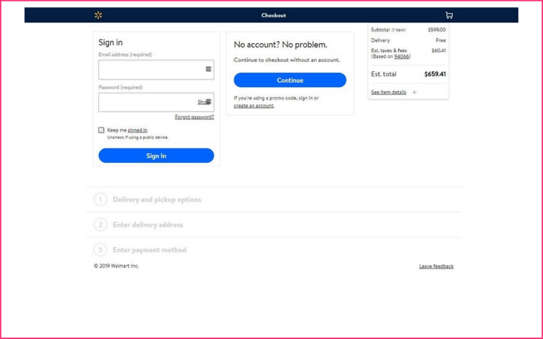
Walmart also does not ask customers to register their accounts to check for items. You get the minimal form option here. You can either have items delivered or picked up from a nearby store.
6. BigBasket:
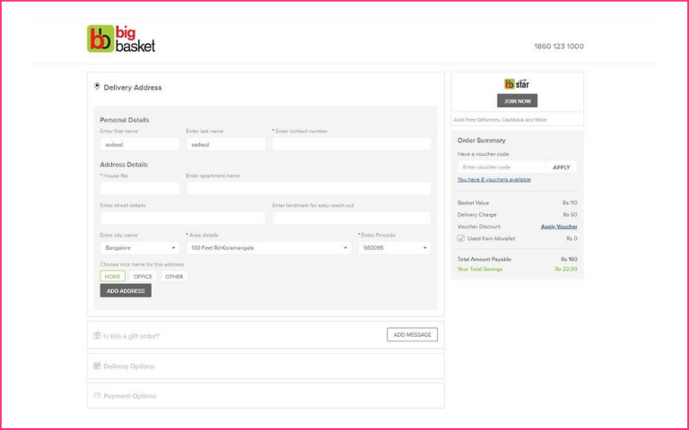
The Indian online grocery shopping app, BigBasket, has a very clean checkout page. Customers can easily select products and apply coupons directly from the checkout page. It features a simple step-by-step process, thus providing a smooth shopping experience.
To conclude
One-page checkouts are a must for any eCommerce store owner if they want to enhance their sales. With the above-mentioned strategies and one-page checkout examples, we hope you will find designing the one-page checkout a bit easier now.
However, the best way is by A/B testing or experimenting with different styles to find out what works best for you. Once you have figured that out, you can make your one-page checkout process smooth and easy for your customers.
FAQs
One-page checkout is better than multi-page checkout as it reduces the number of steps and makes the entire process quick.
Your goal should be to keep your checkout page simple but at the same time add all the relevant information out there, such as product name, shipping details, shipping address, shipping methods, payment options, etc.
One-page checkout is very important for any eCommerce owner as it helps in reducing the cart abandonment rate, thereby increasing sales. The easier the one-page checkout process would be, the better the customer experience would be.