Checkout and Conversion
4 eCommerce Checkout Page Design Principles To Boost Conversion (The Nimbbl Perspective)

If you think customers won’t return from purchasing a product after reaching the checkout page, you live in a bubble.
Customers can still opt out of a transaction at the last minute if they find a checkout page confusing or doubtful.
While there can be multiple reasons behind such an action, a complex checkout process and unresponsive eCommerce page design often take centre stage.
According to Shopify, a long and complex checkout process is responsible for cart abandonment in 18% of situations.
However, most eCommerce merchants don’t realise that a checkout page doesn’t have to be complicated—the opposite. A checkout page design is supposed to communicate product details, price, payment mode, and shipping details to customers before they place an order.
We at Nimbbl have recently revamped our approach to creating the best customer checkout experience. Our new approach has helped our customers achieve remarkable results, including increasing transactions and reducing cart abandonment rates for digital merchants.
This blog post lists what we have learned, along with examples. Let’s get to it.
Content Index
4 eCommerce Checkout Page Design Principles that Helped Us Increase Transactions
Here are the four eCommerce checkout page design principles that we follow at Nimbbl:
#1 Personalisation
One of the most impactful changes we made was personalising the checkout experience for each user. Personalizing the payment experience is the tailored payment solution that enhances the user experience by adapting the checkout process to individual customer preferences and behaviors.
By capturing user preferences and past transaction data, Nimbbl can pre-fill payment details in UPI and BNBL apps, making checkout personalized and providing customers with an advance view. By leveraging data like the customer's mobile number, we were able to present the most relevant payment methods upfront.
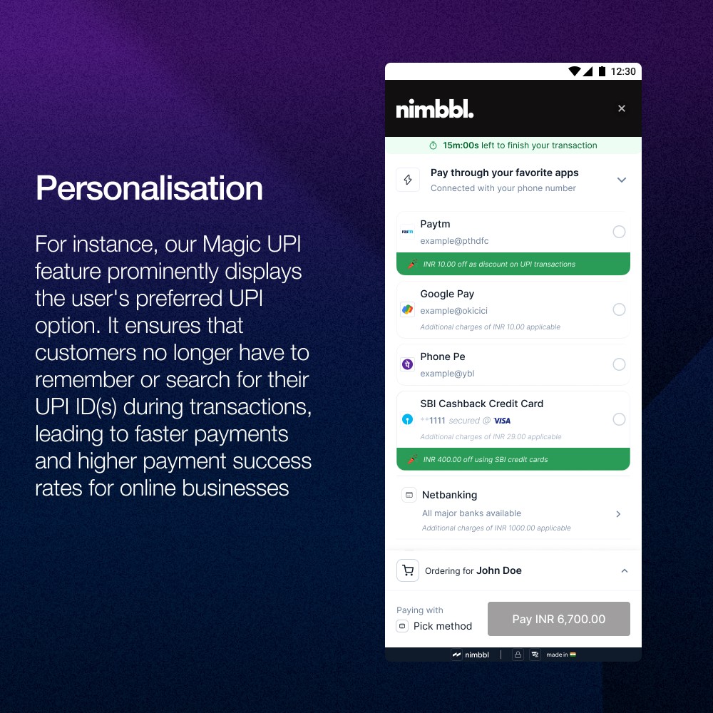
For instance, our Magic UPI feature prominently displays the user's preferred UPI option. It ensures that customers no longer have to remember or search for their UPI ID(s) during transactions, leading to faster payments and higher payment success rates for online businesses.

Checkout personalisation
This personalisation extends beyond payment methods. We pre-fill known information, minimising the number of form fields users need to interact with.
The result? A faster, more intuitive checkout process that feels tailored to each individual. This approach improved user satisfaction and led to a notable increase in payment initiation rates.
UPI has become India's most loved and fastest-growing payment method, but it's not without its challenges. UPI ID-related issues contribute to 20-25% of payment drops. We implemented Magik UPI to address this, revolutionising the UPI payment experience across mobile apps and browsers.
Magik UPI has reduced the initiation time of UPI payments by an impressive 70%, which has significantly impacted our overall transaction rates. After launching Magik UPI, we saw the share of UPI transactions grow by approximately 25%, taking a significant share away from card payments.
This shift improved the consumer experience and reduced our payment processing costs. Moreover, by streamlining the UPI payment process, we've reduced cart abandonment rates by ~3% to 4%.
#2 Showcasing relevant information
We realised that many users abandon their carts not because of price or second thoughts but because they are uncertain about their purchase details. To address this, we redesigned our checkout page to display all relevant information clearly and concisely.
For example, if a customer purchases multiple clothing items, we ensure that the product names, sizes, colors, quantities, and available delivery dates are visible throughout the checkout process.
Alternatively, we display size, colour, and quantity information for apparel purchases.
This approach eliminates the need for users to leave the checkout page to verify details, reducing abandonment rates and increasing customer confidence in their purchases.
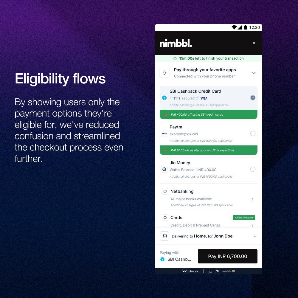
Additionally, we've implemented eligibility-based flows, which have increased payment success rates for our customers by 5-10%. By showing users only the payment options they're eligible for, we've reduced confusion and streamlined the checkout process even further.

Nimbbl eligibility flows
#3 Transparency
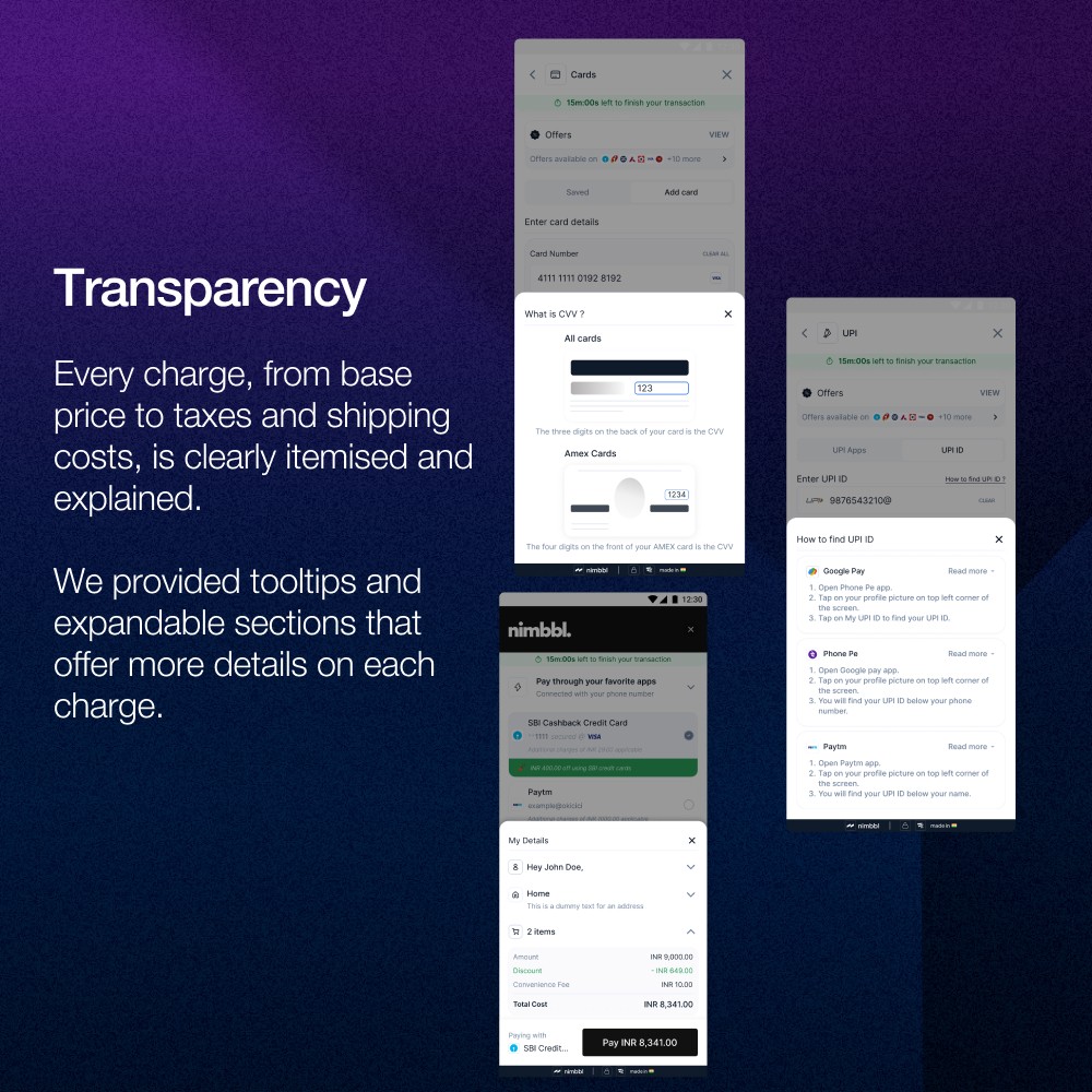
Hidden fees and unexpected charges are significant contributors to cart abandonment. We tackled this issue head-on by implementing a policy of complete transparency in our checkout process. Every charge, from base price to taxes and shipping costs, is clearly itemised and explained.

Checkout transparency
We provided tooltips and expandable sections that offer more details on each charge.
We highlight payment methods with specific fees, such as upfront EMI processing charges. This transparency also extends to our language choices—we avoid jargon and provide clear explanations for any technical terms we need to use.
The result? Customers feel informed and in control, leading to increased trust and higher transaction completion rates.
Our data shows that the average payment time ranges from 5 to 30 seconds, depending on the payment mode. By being transparent about these timeframes and setting clear expectations, we've been able to reduce user frustration and increase trust.
#4 Error handling and prevention
Even with the best-designed checkout, errors can occur. Our approach to error handling focuses on prevention and clear resolution paths when issues arise.
We implemented proactive measures, such as BIN checks to verify card support before processing and real-time warnings about known issues with specific payment methods.
When errors occur, we provide clear, actionable messages that guide the user through resolving the issue.

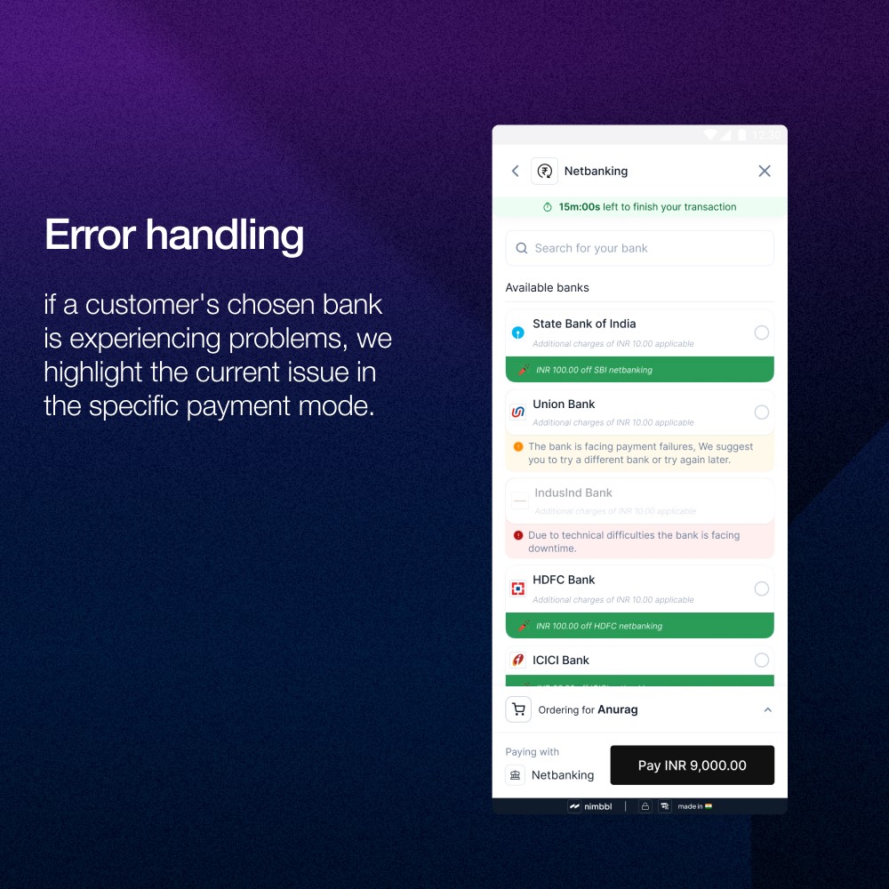
Handling payment errors
For instance, if a customer's chosen bank is experiencing problems, we highlight the current issue in the specific payment mode. The user then chooses to proceed with the payment mode.
We also developed a comprehensive system to handle many potential error codes, ensuring that the user receives helpful guidance no matter what happens. This approach reduces frustration and keeps users in checkout, significantly improving our transaction completion rates.
The Results Achieved by Nimbbl
By implementing these four principles—personalisation, relevant information display, transparency, and robust error handling—we created a checkout experience that meets user needs and exceeds their expectations.
The results have been awe-inspiring:
UPI transaction share grew by approximately 25% after the launch of Magik UPI
Cart abandonment rates were reduced by 3-4%
Payment initiation time for UPI was decreased by 70%
Success rates improved by 5-10% through eligibility-based flows
Moreover, our data shows that different payment methods have varying levels of efficiency:
BNPL (Buy Now Pay Later) transactions have the highest success rate, being 38% higher than debit cards and 12% higher than credit cards
UPI transactions have a success rate that's 31% higher than debit cards and 6% higher than credit cards
Most customers complete BNPL transactions within 7 seconds, making it the fastest payment method
Cards take 12.5 times more time to complete than BNPL and 3.25 times more than UPI intent flow
Want to achieve similar results with Nimbbl’s done-for-you checkout experience?

